Organize For Spring!

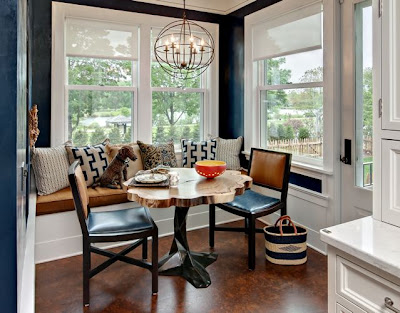
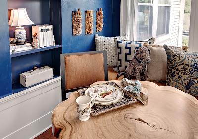
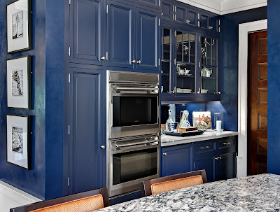
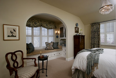
Today we get spring cleaning inspiration from these clean and organized spaces. Remember our post about mudrooms, it included a lot of great ideas for organizing and maintaining the cleanliness of one of the most overlooked room in your home.


Start Small
Tackling large organization projects may seem overwhelming and take more time then you bargained for. By breaking your large projects up, you can take 15 minutes out of your day and organize those miscellaneous piles into baskets. If a large project needs to be tackled in a day, save these for weekend projects. By completing smaller tasks throughout the week, you will feel a sense of accomplishment. 

Make Lists
Making a to-do list will insure you don’t forget any tasks, also you will feel a sense of accomplishment when you are able to cross the tasks off! Keep your list handy, so you can add tasks when you think of them.

Invest in Storage
Ideally, if you have the means to invest in a professional organization system, please go for it. You can source local professionals on Houzz. If not, invest in to stylish baskets, boxes, or containers. This will make you look forward to spring cleaning meanwhile making your space look great!

More inspirational photos on our houzz page!

Kitchen Design….. Done Right

We all know the heart of the home is the kitchen, so be sure to take these important considerations into the design of your kitchen. We spoke with Karen Soojian, principle of KSID Studio a Twin Cities based Interior Design firm to get her inside scoop on what makes a well designed kitchen.

What are the most important things to incorporate into kitchen design
How many times have you heard friends and family saying “We always end up in the kitchen.” The truth is, this is where many of us live today. In my opinion, all of the aspects of kitchen design are equally important. How can you design for one feature and not the other?

For example, you might have a functional layout but your surface selections don’t fit your needs. Your counter is beautiful but your lighting is poor. Your kitchen appears beautiful to the eyes but your cabinets don’t function well for your storage needs. Your kids do their homework in the kitchen but there is no where to plug in their devices.

In the design process each decision leads you to a different conclusion. It is like fitting all of the pieces of the puzzle together. I usually consider several layouts and may end up selecting components from each. Kitchens today are hardworking spaces that are both the social center for family interaction and entertaining.

What are the best options for countertops
When making countertop selections for the kitchen it is important to decide on a material that fits in with your lifestyle. There are so many options out there, from the familiar granite to more unusual surfaces such as concrete or copper.

I advise my clients to consider the benefits and drawbacks of the products they are considering and be truthful about how they will live with it. Combining countertop surfaces in a kitchen is commonplace now. I am currently designing a kitchen that will have three different surfaces: soapstone, live- edge wood and copper. Each area has different functions and each require different maintenance. My client loves them for their aesthetic qualities and feels comfortable they will be able to maintain them.

What are the best options for kitchen flooring
Again, it depends on what your priorities are. For comfort underfoot, I have had several clients request cork flooring lately. It is very comfortable to stand on and easy on the back. I designed a kitchen in the ASID showcase house last year and the homeowners requested cork flooring. Green initiatives were a high priority in this project. Cork flooring holds up extremely well with particularly high traffic areas.

ASID Showcase House 2012
ASID Showcase House 2012 
ASID Showcase House 2012

The 2012 ASID showcase house kitchen was part of a large scale renovation of a Victorian-era home built in 1899. As stated, green materials and principles were a high priority in the renovation. We put a modern twist of classic American style. Inspired by men’s fashion we chose a color palette of navy, white and tobacco.  The homeowner was the architect on this project, John Larsen of Design 45 and this project was photographed by Mark Ehlen of Ehlen Creative.

For durability clients prefer natural stone, concrete, porcelain or ceramic tile. For warmth and character you can’t beat reclaimed wood flooring. The more distressed they are the less wear and tear they show. Everyday wear blends right in!

How can one personalize your kitchen without committing to something permanent
Don’t forget to allow a place for artwork or photography to add personal flair in your kitchen. Carefully chosen light fixtures have an amazing impact on a kitchen both visually and functionally. Wallpaper while somewhat permanent, is once again enjoying resurgence.  Window treatments can help you define your kitchen’s personality as well.

Important factors to consider in kitchen design layout
A functional layout is key, you need to consider the working triangle. All the legs of the triangle should be approximately four to nine feet. You need to be able to work efficiently between your sink/ preparation area, stove and refrigerator. You will waste a lot of time in your kitchen preparing a meal if this classic idea is not well thought out and incorporated.

Unique features to incorporate into your kitchen design
There are too many unique cabinet details, door styles and other options that are available to even scratch the surface. An example of something unique would be incorporating different types of inserts into cabinet doors ( more interesting then just glass) such as antique mirror or copper with a beautiful patina.  You might select architectural elements such as iron brackets for shelves or carved corbels for your island.

For a sleeker look you can use back- painted glass or stainless steel on the backsplash. You can select your cabinet hardware to be the jewelry of the kitchen or opt for no hardware to reinforce a sleek design. Using unexpected patterns and colors on the floor or ceiling can make a bold statement. There are endless options!

Trends in kitchen design
A strong ongoing trend that everyone seems to follow these days is the white cabinet, white subway tile, Carrera marble trend. New trends on their way into the American market include the increased appearance of gray and greige for cabinets as well as walls. Brass faucets and light fixtures are once again becoming very popular. Designers like the contrast between the warmer metal and the gray or griege background. This is not the shiny brass of the past but a sophisticated antique brass.  Some designers are using unpolished brass that is considered a live finish because it will change over time.

Upcoming trends in European kitchen shows include the use of natural wood finishes, counter materials and added textures. Bloggers who have attended these design shows say that glazed cabinets we have seen so abundantly in the past were nowhere to be found. Also they have reported seeing a lot of glossy cabinets and color blocking with bright colors. Strong eclecticism was seen.

For appliances integration was noted. The kitchens were decidedly sleeker and more modern. I have also noted that appliance companies such as Blue Star, and  Smeg  are making customizable color features available. They are daring but really beautiful.

A huge thank you to Karen for sharing her expertise in kitchen design and trends. Check out more of her work on her website and houzz page!

Featured Designers- Indicia Interior Design

This month we are excited to feature not one but the three designers that make up the St. Paul based interior design firm of Indicia Interior Design.  Indicia Interior Design and Furnishings is an award-winning, full service interior design firm that specializes in projects that encompass both new construction and remodeling of existing residences.

(Top Right – Anita, Bottom Left – Daisy, Bottom Right – Krista)

Share your background
Krista: Graduate of the Interior Design program, U of M

Daisy: I have over 10 years in design with an emphasis on new construction and remodeling

Anita: Interior Designer/ Kitchen and Bath Designer with over 20 years of experience working with high end, mostly residential design

Highland Park Home by Krista

If you could live anywhere in the world, where would it be and why
Krista: I am drawn to New Orleans; I love how food and music are so interwoven into the soul of the people and the town.

Describe your dream home in five words
Anita: Charming, timeless with exquisite materials!

What are your hobbies
Daisy: Working out, reading and shopping

Chanhassen Home by Daisy

Five things you can’t live without
Anita: Family, friends, my dogs, lipstick, design magazines, chocolate and coffee (oh that’s 7)

What are your favorite local shops and restaurants
Daisy: Shops- Anthropologie, Ampersand, Surdyks
           Restaurants- Zelo, WA Frost, San Pedros, Nova

Describe one of your favorite projects
Krista: A little Cape Cod style home in the Highland Park neighborhood of St Paul. The client loves super clean contemporary lines and wanted to remodel her bathroom to reflect this aesthetic. We took the space down to the studs and transformed the space into a lux spa. It made the pages of the June 2012 issue of Kitchen and Bath Ideas!

Anita: One I recently finished is a fun mix of old and new. We kept the charm that was there and added lots of practical living space. There are contemporary elements, colors and materials you would not expect in a lake cottage. The clients had a lot of input and great taste!

Modern Cottage by Anita

Daisy: Whole house remodel in Woodbury. The transformation from sterile builder-white to warm, inviting, traditional was remarkable.

Who is your favorite artist/ furniture designer
Daisy: Artist- Henri de Toulouse-Lautrec- Love his irreverence!
           Furniture- I tend to favor mid- century modern which includes many of the greats but the one that stands out for me is Eero Saarinen- His Tulip chair is iconic!

Eero Saarinen’s Iconic Tulip Chair

What is your favorite room in your home, why
Daisy: Our Master bathroom- despite that it’s not a large space, it truly feels like a luxury spa

Daisy’s Master Bathroom

Fill in the blank, no room would be complete without…
Krista: Your own personality!

Do you have “go to” paint colors, if so which ones
Anita: White Dove from Benjamin Moore and any color that is slightly “off.”  One of my favorite sayings is “there are no bad colors, just unfortunate combinations!”

A huge thank you to Indicia Interior Design, see more work on their website and Houzz page!

Expanding Upwards

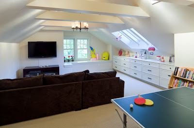
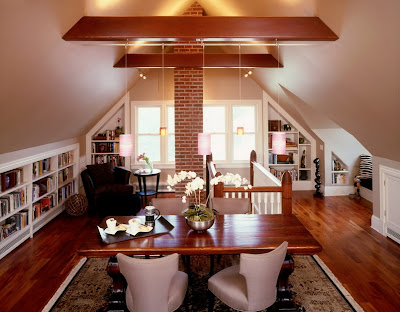
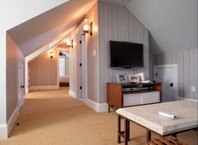
Could you use more living space? Do you have an attic filled with nothing but cobwebs and storage boxes? Don’t overlook the valuable space in your attic that has a magnitude of potential. Dreaming of a home office, master suite or family room; start making plans to expand upwards! 
Here are some inspirational images to get you excited about the endless potential.

Images:1

Dining Room Design

I spoke with Angela Parker, ASID of Interior Places and Spaces, LLC on dining room design, here is what she had to say.

Dining rooms are the jewel of entertaining for every home. The art of family dining brings visiting guests and family together for conversation, communication, and enjoyment. 

Flexibility
First, determine how often one will be seated at the table. Note how many immediate family members will be dining daily for breakfast, lunch, dinner and late night meals. Next, think about holiday meals, and whether the entire clan will be over for special events. 

The dining room space often has to allow for comfortable and intimate seating for two one moment, and then expand to allow seating for eight to twenty. While remodeling and designing kitchens, clients have requested opening up the wall to their dining room to allow expansion of the dining table. This expansion will allow for all the family to be seated together for Thanksgiving, Christmas, Hanukkah, Rosh Hashanah, and other special events. 

Designer top five picks for a fresh new look without breaking the bank

1.Apply a fresh coat of paint to your dining room. One of my favorite serene colors for a dining room is Wythe Blue (HC-143- See Hirshfield’s Photo). Your guests will look radiant with this chameleon color. 

Transform a beige dining room into a salsa blend. For this client, Angela designed columns to be faux finished in an orange-red marble, accentuated with faux bois and gilt trim. Mango upholstery, bench and draperies were added to complete this space(Interior Places and Spaces, LLC photo).

2.Recover chairs with textured fabric to the cushions of the chair, with a tailored skirt set with antique nail heads. Brentano has lovely mohair in apple green, forest green, and canary for a fashion forward space. 


3. Wall paper an accent wall with a large scale motif. The exquisite Anna French designed wall paper
St. Germain, exclusively at www.annafrench.co.uk. is a traditional design that will sparkle any room.

4.Install a glass chandelier for a more elegant and timeless appeal. www.filamentlighting.com. The whimsical wrought iron frame in silver leaf finish accented with clear glass embellishments is a showstopper. 

5.Change out the mirror over the side board, reframe it at a local frame shop, or paint it yourself with a new shiny new coat of lacquer. Mirrors give the appearance of a larger space and increase the light level throughout the room. 

Visit the American Society of Interior Design www.asidmn.org. for a qualified interior designer to assist you in designing and developing a custom interior dining room.

Angela Parker, ASID

ASID President Elect Minnesota Chapter

Featured Designer- Pat Manning-Hanson

Pat Manning-Hanson is our Featured Designer of February. For over 30 years Pat has been creating beautiful environments that reflect her clients taste and support their lifestyle.

Share your background
At the U of M my interests were in Studio Art, specifically printmaking and watercolor, as well as Art History and French. Then I realized I need to make a living, so I switched into the Interior Design program, and that is what I graduated with a degree in.  I joined ASID, and passed the NCIDQ, becoming a professional member in 1986. I worked at Collins Interiors, then Daytons Interior Design Studio for 20 years, which became Marshall Fields and Macys. After the design studio at Macys closed, I came to Gabberts Interior Design Studio and have been happily working here since.

If you could live anywhere in the world, where would it be and why
Paris, the city of light.  The way the Seine flows through the city, the beauty  of its architecture, its diversity, restaurants, museums and of course the French.

Describe your dream home in five words
Welcoming, comfortable, light-filled, and retreat

What are your hobbies
Cooking, entertaining and I love traveling!

Five things your can’t live without
My dear husband Charlie, my cats Harry and Sookie, Vinyasa yoga, good food and the natural world.

What are your favorite local shops and restaurants
Shops:  Foreign department stores (when I travel), locally; the Minneapolis Institute of Art, and Walker Art Center gift shop.
Restaurants: Cafe Maude, The Lowry, and Big Bowl

Describe one of your favorite projects
My favorite project is the one most recently photographed. The client found me on the Gabberts website and made a trip across the country to interview me. This project was their third residence soon to become their primary, post retirement home. The space is a 2 level condominium in a new building in downtown Minneapolis, very different from their current, traditional home. They planned to bring only two pieces of furniture from their current home, so we were able to furnish this space completely in a soft contemporary style.

 All of the pieces are designed to complement each other and the space and to function for the clients when they entertain. In addition  to providing a comfortable city retreat for them and their two Jack Russell terriers. My focus as an interior designer is to listen and collaborate with my clients so they can live well at home. This project was uniquely satisfying to me. I hope you enjoy the photos as much as I enjoyed working on this year long project.

Who are your favorite artist and furniture designers
Artist: Georgia O’Keeffe
Furniture Designers: Eero Saarinen and Barbara Barry

What is your favorite room in your home, why?
My living room, because of the pale blue walls (BM #867) and the White Dove painted wide crown molding, baseboard and the fireplace mantel. These are enhanced by an antique Sarouk carpet and the room is flooded with daylight. It is a place of relaxation, respite and a space to entertain and be entertained.

No room would be complete without… 
Art, a mirror and lighting to be reflected in it.

Do you have “go to ” paint colors, which ones are they
Benjamin Moore historical colors in general, specifically, HC-45 Shaker Beige, HC-6 Windham Cream, HC-98 Providence Olive, HC-44 Lenox Tan, and White Dove with any of the afore mentioned colors.

See more of Pat’s work here and follow Purcell Quality on Houzz !

Houzz

We have been actively updating our Houzz account over the past few days. If you aren’t familiar with Houzz, it is the leading online platform for home remodeling, and design. Being the largest online source for home improvement, it has everything from you need to better your home from start to finish. Helping you find great design ideas and storing them in your idea books is truly just the beginning to this ever changing site.

Follow us : www.houzz.com/pro/purcellquality to stay on top of great remodeling and design!

Image: 1

Children’s Rooms

Kristen Sheikh of Bruit De La Mode  and Billie Marie Tharaldson of Julian Inc.  share some designer tips regarding designing children’s rooms.

Kristen shares “When designing children’s spaces, I have multiple clients that I need to take into consideration- the parents and the kids, who will be growing and evolving as they use the space over the years. As a parent myself, I understand how it isn’t as quick and easy to update a play space as it is for an adult bedroom.  Things like furniture scale, from crib to “big kid” bed, will change over the years and the interests of the child will grow and change. Children’s spaces need to be flexible so they can evolve with child. It needs to be a space that can foster creativity and a retreat where they can feel safe, cozy and relaxed.” 
Billie who grew up in the design industry,  has always had a passion for children’s room design. “Storage is key, it is one of the most important factors in designing children’s rooms. You have to make the storage accessible, easy and fun, otherwise children will not want to use it. Prior to going out to the space, I have a conversation with the parents to confirm we are on the same team, we discuss the budget and expectations.  Most children don’t have much input on their room until they reach about 12 years old. It is at this age they want to have a space that is all their own, and they want it to reflect their personality.”
What are the things that one should keep in mind when determining the design?
Kristen:

A few key things to keep in mind when I am designing a children’s space: 
  • Keep the design aesthetic and harmonious.
  • Scale: What are the ages of the kid(s) that will be using the space? If kids of multiple ages are using the same space, adjustments will need to be made to ensure all the kids will have spaces to call their own. 
  • Storage is a paramount need. As a mother I know that it is a fantasy  to believe that all the toys live in only one spot. Kids need options of places to put toys and books that are easily accessible. Being able to see all the items that they have to play with can help minimize what I call the “toy box terror” when kids pull out every item from a toy box looking for one particular toy and creating a toy explosion.
  • Life cycle of the furniture, how is it going to evolve over time. I try to speculate the needs of the client 5 years out, to give them a space that can save money in the long run, not needing a major update in a few years. 
What are some ways to maximize storage in a children’s room?
Billie:
  • As previously stated, STORAGE IS KEY! You need to incorporate dual purpose furniture, I love beds with storage underneath, bins are so easy to use!


Where do you get your jumping off points and inspiration?
Kristen:
  • Inspiration comes from everywhere!  When I started designing my son’s room, my inspiration came from a pop-art painting I bought at the Uptown Art Fair in Minneapolis. Using that painting along with color inspiration from the adjoining living space, I built the palette and began  designing off of that painting. 
Billie: 
  • Many times inspiration can come from children’s artwork, this is always a great starting point.  Add a chalk board wall into the space or colorful pin up boards. This is a simple way to give them lots of space for creativity and make the room unique to them. 
Tips on designing a room that can easily transition through the years?
Billie:
  • Invest in furniture that can grow with the child, pieces they can take with them when they are off to college. If you invest in quality furniture, it will last for years! Pull fun prints and colors into the design in the bedding, wall color and a fun pillow or two. Also don’t over do a child’s  bedroom with lots pillows, chances are they won’t want to spend time putting all of the pillows back on.

Theme rooms, yes or no?

Kristen:

  • I am personally not a fan of over the top theme rooms. I think its really easy to be drowned by a theme room that is coordinated down to every last detail. I feel a theme can be conveyed through a couple of collected items. 
Images: 1
Thanks!

Color Palettes

Are you wanting more color in a room, but just don’t know where to begin? We spoke to three interior designers to get advice on this tricky topic. Renae Keller of Renae Keller Interior Design shares her insider tips. Brenda Higgins and Gina Atkinson of Kitchen Comfort, a kitchen and bath design studio share where their inspiration for palettes comes from and how colors in kitchens vary from the rest of the home.

Share a few favorite palettes
Renae: 

  • Grass green, timber brown, and bright white. I used this palette in a living room design I recently completed.

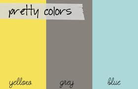
  • Yellow, gray and blue
  • Bottom line… my favorite color to incorporate into design is ORANGE! It’s not for everyone but I really enjoy it!

Gina & Brenda: 

  • Triadic color schemes, which are diverted by placing an equilateral triangle on the color wheel. Thus any three colors  combined in a triadic color scheme are equally spaced and balanced. 
Interior examples:


Where do you find inspiration?

Renae:

  • Design seeds– an online site for palette inspiration
  • Artwork
  • Food
  • Furniture
  • Tiffany boxes, I can never get enough of these!


Brenda and Gina:
  • Inspiration comes from all around; from clients, art, even counter tops. We are in the process of designing a bathroom, in which the inspiration came from the Cambria counter top!

Why is lighting an important factor when selecting paint colors for a space?

Renae:
  • Lighting is a very important factor, I always compile a list of questions for my clients prior to selecting any colors. They include: What are you going to do in his room, how long will you be in this space, when do you typically spend time in here (day vs. night). All of these factors will help determine the intensity of color to use in the room and how much of it.
Brenda and Gina:
  • Lighting is a very important factor when determining paint colors for a space. Color temperature plays a huge role in selection of paint colors. It is a characteristic of visible light in a space. Cooler color temperatures in lighting are going to give the room a colder feel and be more blue in color. While warmer color temperatures are going to give the feel of a yellowish/ Orange color and create the feeling of a warmer space. Color temperature also plays an important role in kitchen and dining room design, since certain colors are more pleasing to the appetite. 
Online sites for palette assistance and inspiration

Renae: 
  • I love design seeds, as I previously mentioned. There are color palettes everywhere you look and this website has them all! You can search by color, season, feeling,ect.. It is a great place to get started!
Gina and Brenda: 
  • A great jumping off point is Houzz.com. You can search by style and color. It is a wonderful tool to use when you need inspiration!  There are also other online color palette tools such as: Kuler, Colormunki, and Copaso. On many of these sites you can create your own color palettes and save them for future use. 
What are some ways to create fun, bold color palettes without painting a room a dramatic color?
Renae: 
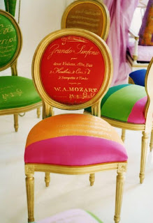
  • Using different paint finishes, such as glossy and matte to create a unique look. Also adding in color blocking in furniture or accessories. This creates a bold color combination without having to commit to a bold wall color. 
Gina and Brenda:
  • Introduce various patterns into the design. Another tip is to create a fun look without painting bold colors is to introduce two pain colors, one two shades darker than the other and do a stripe.
We hope this expert advice gave you a kick start to adding some color to your space this year!

Sources: 1

Featured Designers – Fiddlehead Design Group: Andrea Dixon & Jen Ziemer

Andrea Dixon and Jen Ziemer met in design school and quickly became friends. They both share a love for design, music, perfectionism, and a passion for people. Twelve years later, they are still sharing the same passions as  Fiddlehead Design Group.  Andrea and Jen are our Featured Designers for January, and we are thrilled to share a bit about them.


Share your background
A: I have a major in studio art and a minor in management from St. Olaf College. After a few years  of being a business analyst for Target Corporation I decided to leave to pursue something more creative. I enrolled in a full time Interior Design program and this is where I met Jen, who was also pursuing a second career. After graduating I worked for two design/ build firms (one of which specialized in kitchen and baths) before reconnecting with Jen in 2007 and forming Fiddlehead Design Group. With our combined industry knowledge we are able to offer a wide range of design services and tend to have many repeat clients. 
J: I have a degree in Elementary Education and was a teacher for three years in Minneapolis. I left that career when I had my first son and decided to return to school for Interior Design. As Andrea said, this is where we met, we worked for the same design/ build firm for a number of years after graduating. I left that firm to join a residential firm where I stayed until we started Fiddlehead.

If you could live anywhere in the world where would it be and why
A: I have been fortunate enough to travel to some amazing places but I would have to say my very favorite is Norway. The city is full of art and culture,  the countryside is magnificently beautiful and packed with outdoor activities. The people are more then friendly and committed to a healthy lifestyle. On top of that I really love the simplicity and artisan quality of Scandinavian design… needless to say, I had a hard time leaving!
J: It would definitely have to be a large city for me. I think London would be a fun place to live. The city has rich history, beautiful architecture and has so much to offer the Interior Designer in me, not to mention the shopping… Harrods! Even though its a big city, it manages to keep that small neighborhood feel with quaint cafes and beautiful boutiques and shops.

Describe your dream home in five words or phrases
A: Full of natural light, painted- large scale trim work, not a large home- but every inch customized for our use, amazing kitchen and a touch of whimsy.
J: Colorful, warm, comfortable, layered, inspiring.

What are your hobbies
A: Music has always been a huge part of my life. I have played the cello for 25 years and have sang and played the piano for even longer. I also love to draw, water ski,  spend time at our cabin, , walk around the Minneapolis lakes and do yoga. Of course nothing beats spending time with my five year old daughter, husband and yellow lab. We’ve also got a baby boy on the way in April and I can’t wait to expand our family.

J: Anyone who knows me would say shopping, so I guess I will too! I like being active/ working out/ walking the dog in our neighborhood. I also enjoy playing the piano.


Five things you can’t live without
A: Family, friends, a good book, music and ice cream!

J: My faith, family, coffee, sunshine, goals


What are your favorite local shops and restaurants
A: Living in the city, there are so many fun, ever- changing places to try! Some of my favorites include: First Course, Cafe Ena, Prima, Birchwood Cafe, Blackbird, Muffalatta and Cafe Latte. For shopping I love: Patina, Cooks of Crocus Hill, Gallery 360, Three Rooms, Kharma and The Foundry Home Goods.

J: Do you have all day? We really enjoy eating out and of course shopping. Some of my favorites are: Resturant Alma, Bar La Grassa, Cafe Ena, Meritage, Punch Pizza on Grand Ave with the boys! For shopping I enjoy Painta, Stephanies in Highland Park, Arrow in NE Minneapolis, Golden Fig in St Paul, Gallery 360 and Pumpz in the Galleria.


Describe one of your favorite projects
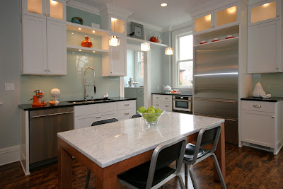
A:  I love to design kitchens because it fulfills both my creative and analytical sides. I also really enjoy cooking and understand what a kitchen needs in order to best function. For this reason, I went on to get an additional certification in kitchen design (CKD) and have been privileged to design some great spaces. One of my very favorites was a kitchen in a very old Victorian home in Crocus Hills. We re-worked the floor plan of the kitchen and butlers pantry without increasing the footprint and designed a space that still acknowledges the homes original character but also incorporates more contemporary design aspects. We were very fortunate to have it published in Better Homes and Gardens last October!
J: I have to say, when I think of a favorite  project it has to do with the client more than it does anything else. I enjoy working in all styles of design. My favorite project was a master suite that we did for a long time client. It was the last room in their home that had yet to be remodeled and was finally something they were doing for themselves not for family or guests to enjoy. The end result was something so special because they were so happy and I know they will enjoy it now in their retirement years.


Who are your favorite artists and/or furniture designers
A: This is a really difficult question and I would never want to narrow it down to just one. However,  a favorite local artist of mine is Minneapolis- based Dick Brewer. My husband and I just acquired our fourth Brewer piece, they are always wonderful conversation starters!
J: I love art and am typically drawn to pieces that are colorful and full of energy. My favorite piece is by Maya Eventov that we have at our cabin. It is of brich trees at night and has heavy strokes. Everyone comments on it.

What is your favorite room in your own
A: Another hard question, especially for someone who likes change. With that being said, I’m hoping that someday soon it will be our kitchen! In the meantime, I’ll settle for our dining room. Of course there are things that I would like to change, but that is the blessing/curse of being a designer!
J: My favorite room in our home is the living room. It is directly off the kitchen and we all end up in there. It is colorful, layered and inviting. 
Fill in the blank, no home would be complete without….
A: A touch of whimsy that brings out the fun side of design and reflects the homeowners personality. Design should NEVER take itself too seriously!

J: Beautiful artwork


What are your go to paint colors
A: We tend to steer towards the Ben Moore paint deck… Chelsea Gray, Porcini, Cathedral Gray, Linen White and Bone White… just to name a few.
J: I’m with Andrea on this one, Benjamin Moore is the way to go. My top picks are: Linen white for cabinets and trim, Kendall Charcoal for cabinets, and Kingsport Gray. 

Thank you Fiddlehead Design Group!