Color Palettes
Are you wanting more color in a room, but just don’t know where to begin? We spoke to three interior designers to get advice on this tricky topic. Renae Keller of Renae Keller Interior Design shares her insider tips. Brenda Higgins and Gina Atkinson of Kitchen Comfort, a kitchen and bath design studio share where their inspiration for palettes comes from and how colors in kitchens vary from the rest of the home.
Share a few favorite palettes
Renae:
- Grass green, timber brown, and bright white. I used this palette in a living room design I recently completed.

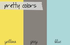
- Yellow, gray and blue
- Bottom line… my favorite color to incorporate into design is ORANGE! It’s not for everyone but I really enjoy it!
Gina & Brenda:
- Triadic color schemes, which are diverted by placing an equilateral triangle on the color wheel. Thus any three colors combined in a triadic color scheme are equally spaced and balanced.
.jpg)
Interior examples:


Where do you find inspiration?
Renae:
- Design seeds– an online site for palette inspiration
- Artwork
- Food
- Furniture
- Tiffany boxes, I can never get enough of these!

Brenda and Gina:
- Inspiration comes from all around; from clients, art, even counter tops. We are in the process of designing a bathroom, in which the inspiration came from the Cambria counter top!
Why is lighting an important factor when selecting paint colors for a space?
Renae:
- Lighting is a very important factor, I always compile a list of questions for my clients prior to selecting any colors. They include: What are you going to do in his room, how long will you be in this space, when do you typically spend time in here (day vs. night). All of these factors will help determine the intensity of color to use in the room and how much of it.
Brenda and Gina:
- Lighting is a very important factor when determining paint colors for a space. Color temperature plays a huge role in selection of paint colors. It is a characteristic of visible light in a space. Cooler color temperatures in lighting are going to give the room a colder feel and be more blue in color. While warmer color temperatures are going to give the feel of a yellowish/ Orange color and create the feeling of a warmer space. Color temperature also plays an important role in kitchen and dining room design, since certain colors are more pleasing to the appetite.
Online sites for palette assistance and inspiration
Renae:
- I love design seeds, as I previously mentioned. There are color palettes everywhere you look and this website has them all! You can search by color, season, feeling,ect.. It is a great place to get started!
Gina and Brenda:
- A great jumping off point is Houzz.com. You can search by style and color. It is a wonderful tool to use when you need inspiration! There are also other online color palette tools such as: Kuler, Colormunki, and Copaso. On many of these sites you can create your own color palettes and save them for future use.
What are some ways to create fun, bold color palettes without painting a room a dramatic color?
Renae:
- Using different paint finishes, such as glossy and matte to create a unique look. Also adding in color blocking in furniture or accessories. This creates a bold color combination without having to commit to a bold wall color.

Gina and Brenda:
- Introduce various patterns into the design. Another tip is to create a fun look without painting bold colors is to introduce two pain colors, one two shades darker than the other and do a stripe.
We hope this expert advice gave you a kick start to adding some color to your space this year!
Sources: 1